


হেরিটেজ অকশনসের ‘ডেভিড অ্যারোনোভিটজ কালেকশন অব ইম্পর্ট্যান্ট সায়েন্স ফিকশন অ্যান্ড ফ্যান্টাসি পার্ট ১’-এর নিলামের খবরটা সারা বিশ্বের বিরল বইয়ের সংগ্রাহকদের...
 সায়েন্স ফিকশন ও ফ্যান্টাসির রূপান্তর: নিলামের কোটি টাকার রেকর্ড থেকে ২০২৬-এর নতুন ধারার বই
2
সায়েন্স ফিকশন ও ফ্যান্টাসির রূপান্তর: নিলামের কোটি টাকার রেকর্ড থেকে ২০২৬-এর নতুন ধারার বই
2
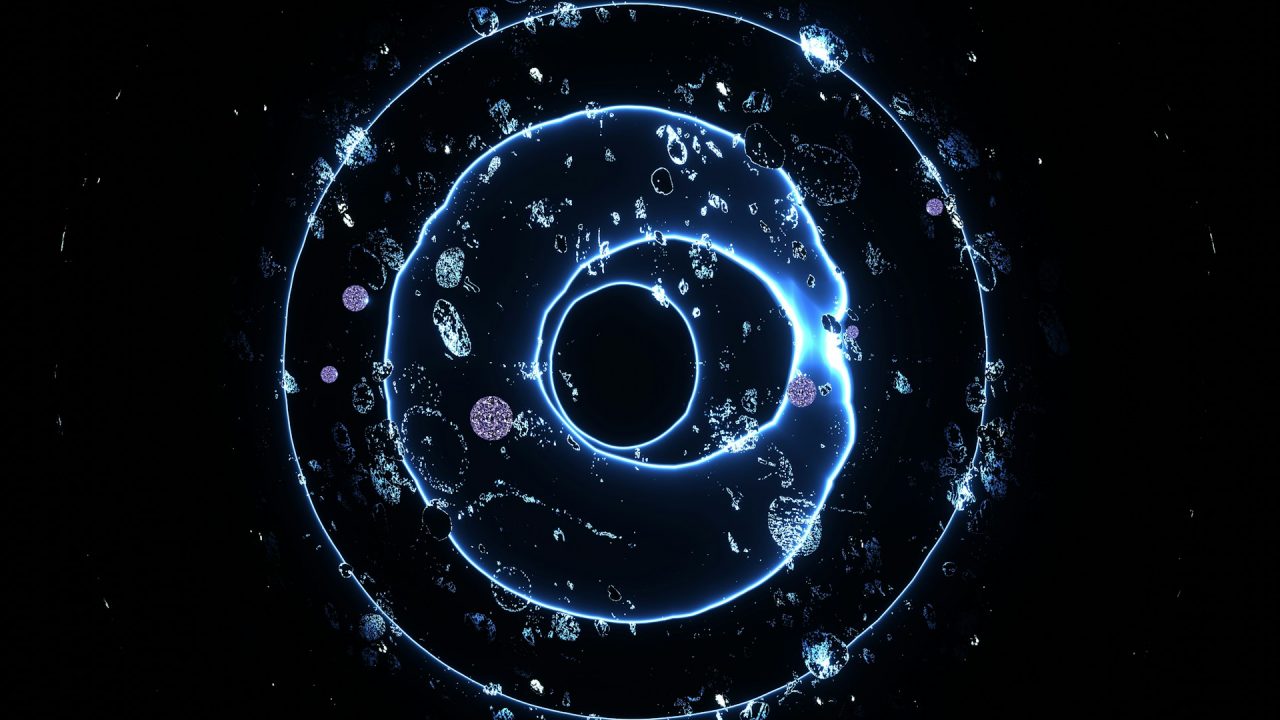
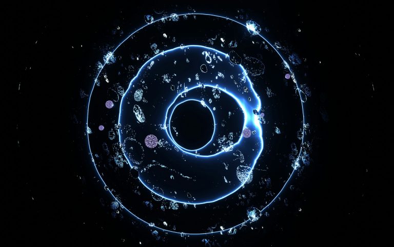
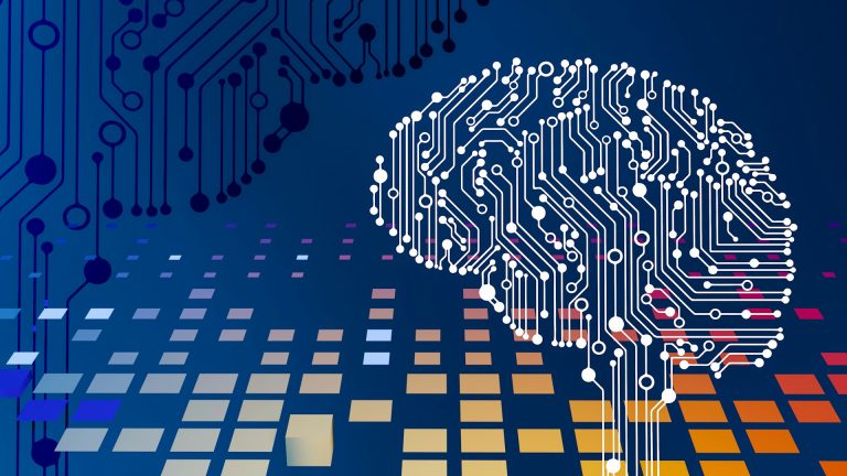
 কৃত্রিম বুদ্ধিমত্তার আসল চিত্র: কর্পোরেট খতিয়ান এবং তরুণ প্রজন্মের মনস্তাত্ত্বিক টানাপোড়েন
3
কৃত্রিম বুদ্ধিমত্তার আসল চিত্র: কর্পোরেট খতিয়ান এবং তরুণ প্রজন্মের মনস্তাত্ত্বিক টানাপোড়েন
3
 রাশিফল ও ট্যারো কার্ডের পূর্বাভাস: গ্রহ-নক্ষত্রের আলোয় কেমন কাটবে সময়?
4
রাশিফল ও ট্যারো কার্ডের পূর্বাভাস: গ্রহ-নক্ষত্রের আলোয় কেমন কাটবে সময়?
4
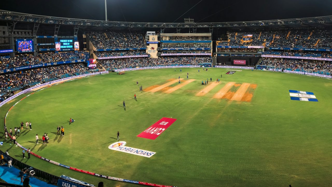
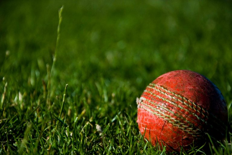
 ভারতীয় ক্রিকেটের দুই কালখণ্ড: যুব বিশ্বকাপে বৈভবের নাটকীয় বিদায় ও ইডেনে সৌরভের রৌপ্য জয়ন্তী
5
ভারতীয় ক্রিকেটের দুই কালখণ্ড: যুব বিশ্বকাপে বৈভবের নাটকীয় বিদায় ও ইডেনে সৌরভের রৌপ্য জয়ন্তী
5
 পন্টিংয়ের প্রত্যাশার পারদ এবং প্রোটিয়াদের কাছে ভারতের চরম বাস্তবতার মুখোমুখি
হেরিটেজ অকশনসের ‘ডেভিড অ্যারোনোভিটজ কালেকশন অব ইম্পর্ট্যান্ট সায়েন্স ফিকশন অ্যান্ড ফ্যান্টাসি পার্ট ১’-এর নিলামের খবরটা সারা বিশ্বের বিরল বইয়ের সংগ্রাহকদের...

বাজারে এআই নিয়ে যত হাঁকডাক আর ভবিষ্যৎবাণী শোনা যায়, বাস্তবের মাটিতে তার প্রয়োগটা ঠিক কেমন? ড্রুইড এআই-এর সদ্য প্রকাশিত ‘২০২৬...
প্রতিদিনের ব্যস্ত জীবনে আমরা অনেকেই একটু দিকনির্দেশনা খুঁজি। গ্রহ-নক্ষত্রের অবস্থান আর ট্যারো কার্ডের রহস্যময় জগৎ আমাদের সেই ভবিষ্যতের পথের সন্ধান...
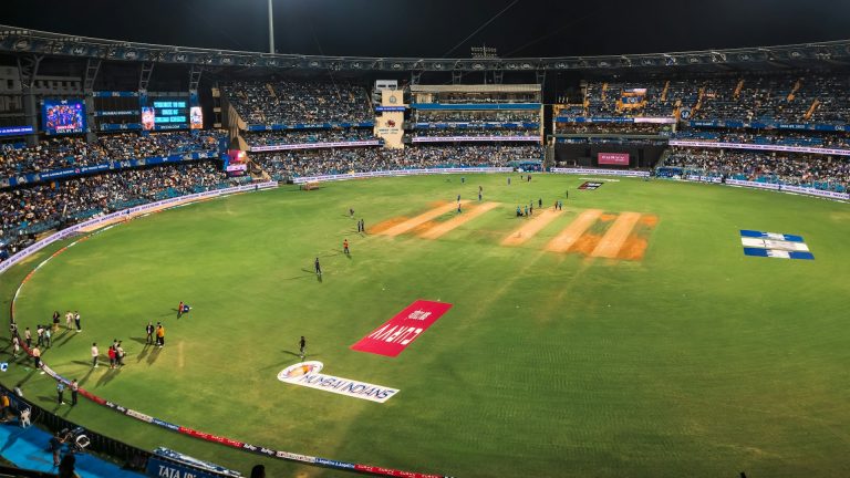
যুব বিশ্বকাপে পাকিস্তানের বিরুদ্ধে ভারতের লড়াইটা বেশ জমে উঠেছে। সুপার সিক্সের এই গুরুত্বপূর্ণ ম্যাচে ভারতীয় ব্যাটার বৈভবের ৩০ রানের ইনিংসটির...
এবারের টি-টোয়েন্টি বিশ্বকাপে ভারতের রানমেশিন হিসেবে অস্ট্রেলিয়ান কিংবদন্তি রিকি পন্টিংয়ের বাজি ছিলেন তরুণ আগ্রাসী ওপেনার অভিষেক শর্মা। আইসিসি টি-টোয়েন্টি র্যাঙ্কিংয়ের...
একসময় মনে করা হতো এডটেক বা শিক্ষাপ্রযুক্তি বুঝি কেবল মহামারিকালীন এক সাময়িক সমাধান বা ‘কনভিনিয়েন্স’। কিন্তু সেই ধারণা এখন আমূল...

আন্তর্জাতিক সাহিত্যের দৃশ্যপটে সম্প্রতি এক উল্লেখযোগ্য ঘটনা ঘটে গেল। কবিতার বিশ্বজনীন যাত্রায় নতুন মাত্রা যোগ করতে যুক্তরাষ্ট্রের ঐতিহ্যবাহী প্রতিষ্ঠান 'একাডেমি...

শিক্ষা খাতে কৃত্রিম বুদ্ধিমত্তা বা এআই-এর সংযোজন এখন আর কেবল নতুন কোনো টুল বা গ্যাজেট কেনার মধ্যে সীমাবদ্ধ নেই। বিষয়টি...
ঢালিউড অভিনেত্রী বিদ্যা সিনহা মিমের ব্যস্ততা এখন তুঙ্গে, পরিস্থিতি এমন পর্যায়ে পৌঁছেছে যে চিত্রনাট্য বা গল্প তৈরি হওয়ার আগেই নির্মাতারা...

কৃত্রিম বুদ্ধিমত্তা বা আর্টিফিশিয়াল ইন্টেলিজেন্স (এআই) এখন আর কল্পবিজ্ঞানের বিষয় নয়, বরং এটি আমাদের দৈনন্দিন জীবনের এক অবিচ্ছেদ্য অংশে পরিণত...